**The Lasting Impact of Mirror’s Edge: A 20-Year Retrospective on Art Direction and Design Philosophy**
Almost two decades since its release, *Mirror’s Edge* remains an extraordinary example of innovative art direction within the gaming industry. Despite the passage of time, few games have succeeded in replicating its clean and purposeful aesthetic. The game’s visual design, described as a distillation of a futuristic world into digital form, set it apart from the drab, lifeless realism that would dominate many titles in the years that followed it. Surprisingly, the artistic choices made during its development were not initially in line with what ultimately defined this iconic game.
In an oral history featured on Design Room, senior developers shared insights into the game’s genesis, revealing that its original design aesthetic was more aligned with the brown-toned visuals prevalent in many Unreal Engine games of the era. Owen O’Brien, the senior producer, noted that this initial art direction did not stand out. Fast-paced movement through this environment resulted in simulation sickness for players, prompting a pivotal decision to streamline the visuals. “We found that when you were moving very fast through the world, you got simulation sickness very quickly,” O’Brien explained. Simplifying the environment and reducing texture details mitigated this issue, allowing players to engage with the gameplay without discomfort.
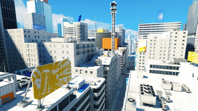
Art director Johannes Söderqvist contributed to the development narrative, explaining that the starting concept revolved around generic urban rooftops resembling a rundown New York. Although this design was aesthetically pleasing, it lacked a distinctive style. O’Brien pushed for a visual identity that set *Mirror’s Edge* apart from contemporaries like *Battlefield*, *Call of Duty*, and *Rainbow Six*. He aspired to create a game that was immediately recognizable from a single screenshot in a magazine.
To achieve this unique vision, Söderqvist and his art team took a radical approach to the game’s color palette. They stripped out most colors from the textures, opting instead for predominantly white environments interspersed with blocks of color to guide players. This decision informed the game’s overall look and feel, allowing it to stand out dramatically in a crowded field.
Lighting artist Oscar Carlén reflected on the implications of this design choice, suggesting that it echoed the protagonist Faith’s character—a beacon of hope in a dystopian society rife with control and surveillance. “Even though Faith is living in this very dystopian society… she has such a hopeful spirit, a bright view of life. The lighting does a great job of making you feel that perspective,” he stated. This interplay between environment and character adds depth to the game, enhancing the player’s experience as they navigate through a world that is both bleak and bright.
As we revisit *Mirror’s Edge* nearly two decades later, its innovative design continues to influence the aesthetic choices within the gaming industry. The game’s commitment to a striking visual style, combined with its engaging gameplay mechanics, has left a lasting impression on players and developers alike. For those who appreciate thoughtful design, reading Design Room’s full piece offers a treasure trove of insights, highlighting the creative journey behind *Mirror’s Edge*. And for newcomers and veterans alike, playing the game remains a reminder of what can be achieved when art and function intersect seamlessly.